Creating a peaceful and relaxing atmosphere in your home often starts with the colors you choose. Calm colors can help reduce stress, promote tranquility, and make your living space feel inviting. But with so many shades and tones available, understanding how to pick the right calm colors can be overwhelming. This guide will walk you through helpful tips for choosing calm colors that suit your style and make your home a restful sanctuary.
Why Choose Calm Colors?
Calm colors have the power to influence mood and atmosphere. Unlike bright or bold hues that energize spaces, calm colors such as soft blues, gentle greens, and muted neutrals soothe the eyes and mind. They work especially well in areas like bedrooms, living rooms, and meditation spaces where relaxation is a priority.
Understand the Basics of Color Psychology
Before selecting your colors, it helps to understand some basics of color psychology. Different colors can evoke varying emotional responses:
– Blue: Often associated with calmness and serenity.
– Green: Represents nature and balance, creating a refreshing environment.
– Lavender and soft purples: Promote relaxation and creativity.
– Neutral tones (beige, ivory, soft gray): Offer subtle and versatile backdrops that calm without overwhelming.
– Soft pinks: Can provide a gentle, nurturing vibe.
Knowing these associations can guide you in choosing colors that align with the atmosphere you want to create.
Tips for Choosing Calm Colors for Your Home
1. Start with a Neutral Base
Choosing a neutral color as your base provides flexibility and a peaceful foundation. Light grays, beiges, or soft whites can balance the room and prevent the space from feeling too busy. Neutral tones also work well with a variety of accent colors if you want to add subtle interest.
2. Consider Your Lighting
Lighting dramatically affects how colors look in your space. Natural light shows colors in their truest form, while artificial lighting (warm or cool) can change their appearance. Test paint samples on your walls at different times of day to see how the colors respond before making a commitment.
3. Use Soft, Muted Shades
Avoid overly bright or saturated hues if your goal is calmness. Instead, choose soft pastels or muted variations of your favorite calm colors. For example, instead of bright turquoise, a soft aqua or powder blue will evoke more tranquility.
4. Create a Color Palette with Harmony
Combine no more than three to four colors in your palette to keep a cohesive look that feels restful. For instance, pair a soft green with neutral gray and a touch of warm beige. Using complementary colors in muted tones helps maintain balance without visual tension.
5. Experiment with Textures and Finishes
Colors can feel different based on the texture and finish of the surface. Matte or eggshell finishes tend to absorb light, adding to a calm effect, whereas glossy finishes reflect more light and can feel more energetic. Similarly, incorporating textured fabrics or natural materials like linen, wool, or wood can enhance the calming feel alongside your color choices.
6. Personalize Your Space
While calm colors are a great guideline, your personal preferences matter most. Choose colors that make you feel at ease and make sense with your home’s overall style. If you love a particular shade that is generally vibrant, consider toning it down or using it as an accent rather than the main color.
7. Use Color Psychology in Room Functions
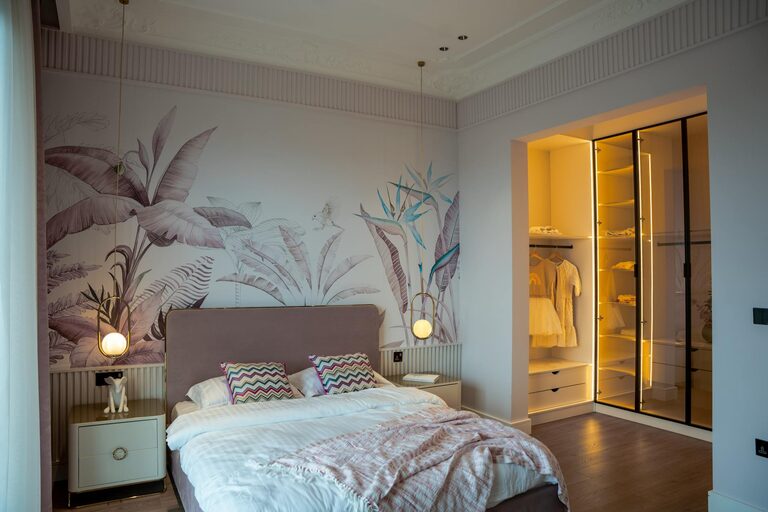
Think about how you use each room. Bedrooms benefit from colors that promote sleep and relaxation, like soft blues or lavenders. Living rooms and family rooms might have a warmer calm palette with soft greens or gentle tans to encourage conversation and comfort.
8. Consider Seasonal Influences
Colors can look different depending on the season and the environment outside your windows. Cool greens and blues may feel refreshing in summer but chilly in winter. Alternately, warmed neutrals might feel cozy in colder months. Keep this in mind when choosing your palette so your space feels welcoming year-round.
Common Calm Color Choices for Home Interiors
– Light Blue: Evokes a sense of peace, ideal for bedrooms and bathrooms.
– Sage Green: A trendy yet timeless choice that connects indoor spaces with nature.
– Warm Gray: A softer alternative to white that creates a cozy yet modern feel.
– Pale Lavender: Adds a subtle touch of luxury and calm.
– Soft Taupe: Neutral and inviting, perfect for living areas or open-plan rooms.
– Blush Pink: Gentle and nurturing, great for bedrooms or cozy nooks.
Final Thoughts
Selecting calm colors for your home is a wonderful way to cultivate a sanctuary that nurtures your well-being daily. By understanding color psychology, testing colors in your lighting, and balancing your palette with texture and finishes, you can create a beautiful, tranquil environment tailored to your tastes. Remember that calmness is not about dullness—it’s about harmony and comfort, so feel free to infuse your personality as you design your space.
—
If you’d like help with picking colors or want inspiration for your specific rooms, many paint brands and interior designers offer sample kits and online tools to experiment with palettes before you start painting. Happy decorating!